
Take My Hand
in which our hero shares the new art he's been working on


Dear Readers,
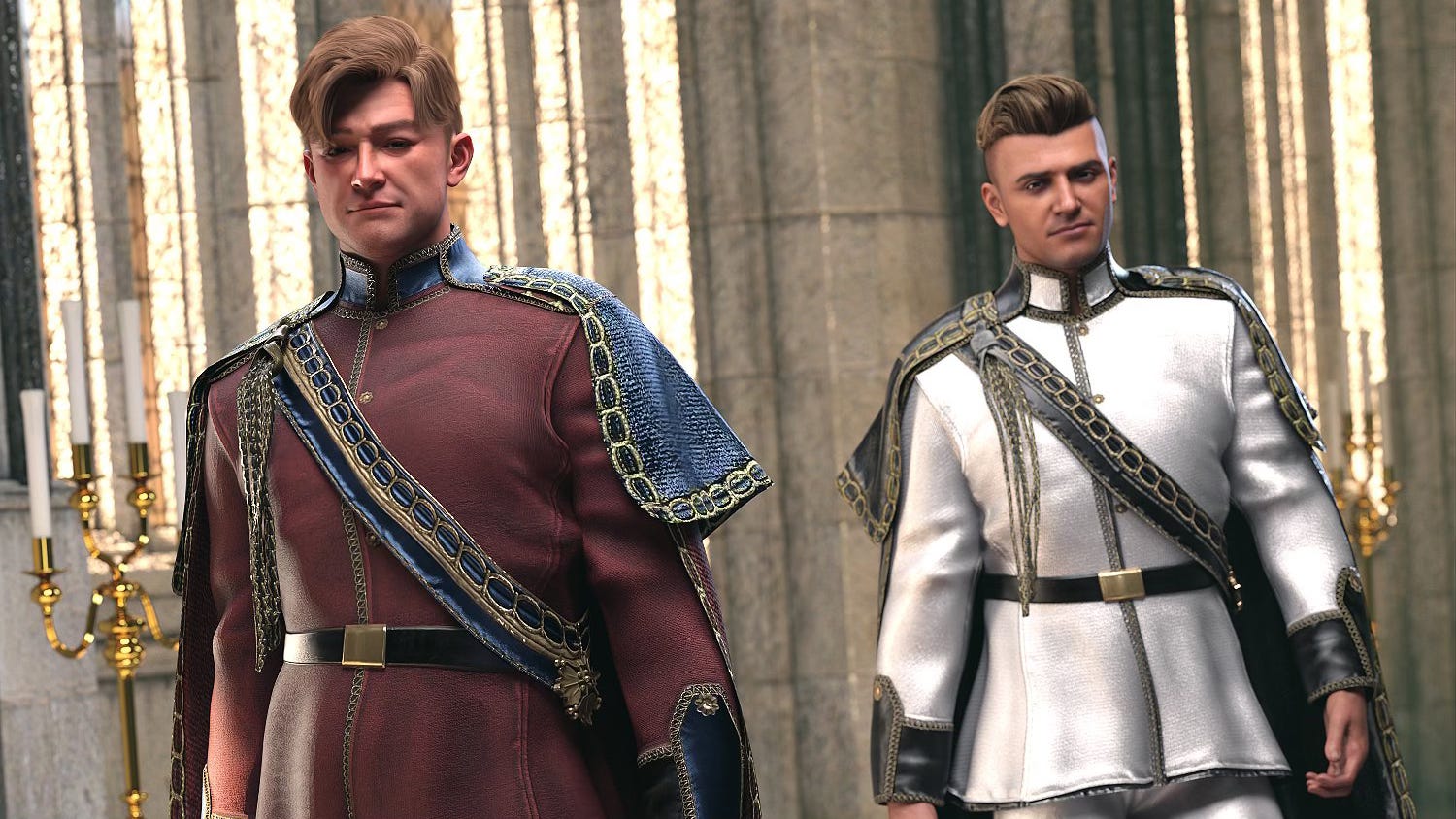
In the interest of full disclosure, I am incredibly nervous about sharing the art above publicly. It’s just a test, but it’s the first time I’ve shown anyone outside of my family what I’ve been working on for the past month.
One of the big things I wanted to work during the extended break between issues 4 and 5 of The Blood of Seven Queens was making the art more “readable.” Just as with readability in text, readability in art is about how hard you—the reader/viewer—have to work to understand what’s going on.
The piece above is the result of months of experimentation and testing to produce an image that:
A) looks more like a traditional comic; and,
B) is less busy with detail than what I’ve done before
I don’t think I’m all the way to where I want to be yet, but I think I’m close. Consider for a moment where the costume this character is wearing started out from. Here’s an image from the Daz Studio store page for Barbara Brundon and Umblefugly’s “dForce Royal Lines Outfit Texture Add-On”:
The textures are gorgeous, but they’re obviously designed with photorealism in mind—the kind of look you’d find in a film or video game. To achieve the new look that I was going for, I had to strip all of the textures away and start with the raw 3D geometry.
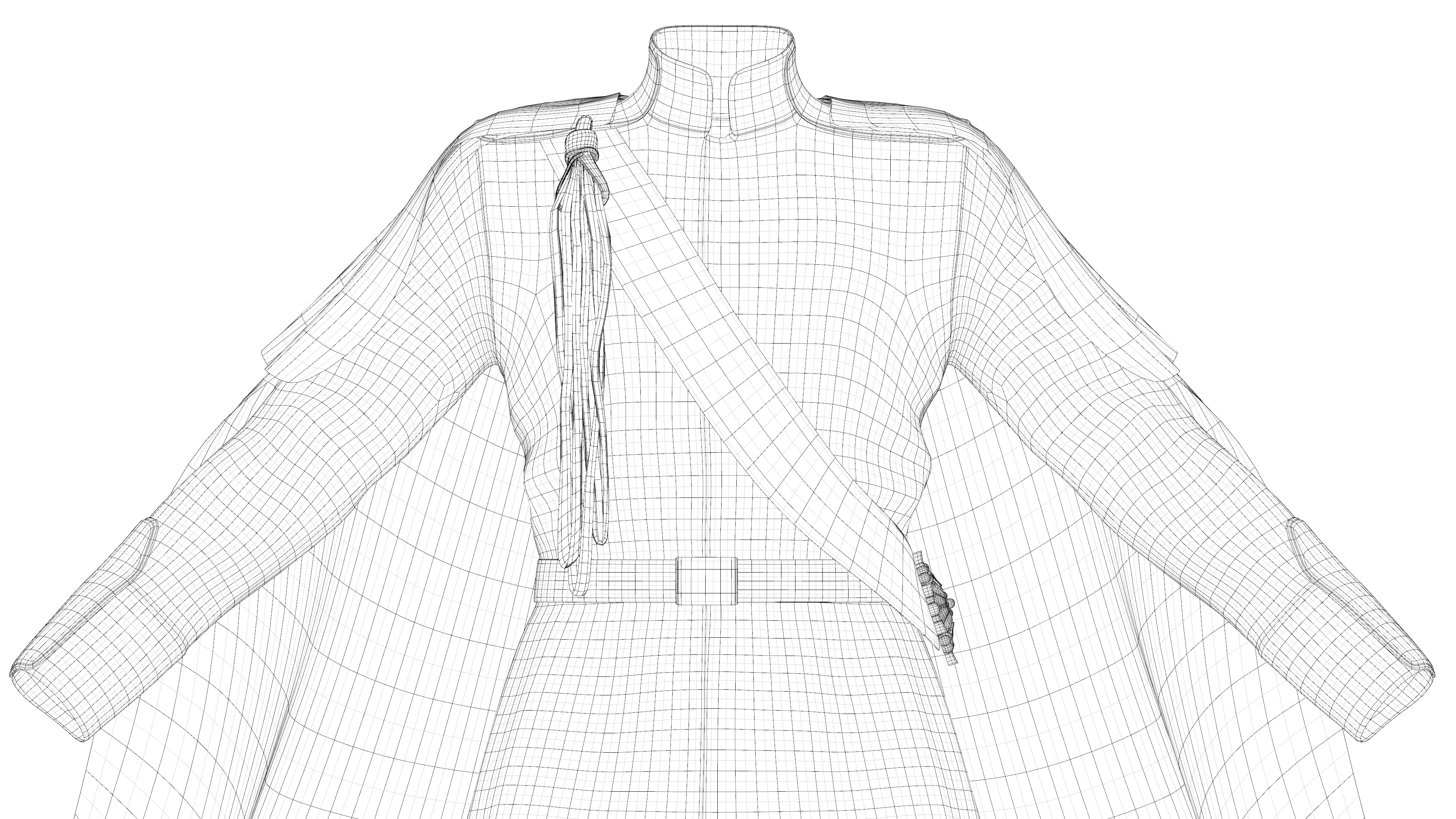
In some cases, the artist behind a Daz Studio product has carefully created various “surfaces” on the 3D model. If that’s the case, I can then apply my own colors and whatnot fairly easily.
That was not the case here, however.
There was only one surface per clothing item, a surface that the highly detailed texture had been laid on top of. Once that texture was gone, if I wanted anything other than one solid color per garment, I had to select polygons by hand and create my own surfaces from scratch.
I’ve now done that for all 19 characters who will appear in issue #5—four of whom have multiple costumes. Next, I work on the sets.
There is, I think, a certain segment of comics artists who view working in 3D as barely more legitimate than working with AI. At least that’s something I spend a lot of time worrying about. I guess I’m sharing this today to prove to myself how much work goes into creating the stuff I make. And that’s not even counting all of the scene design, shot choices, posing of the characters, and everything else!
Maybe I have more to talk about in the newsletter than I thought, huh?
Yours,
Chris
P.S. The character in today’s piece, who you’ve only met once in one panel of issue #1, is Princess Gwen of Yesterland. As for who she’s reaching her hand out to, you’ll have to wait until issue #5 to find out!
I'm absolutely fascinated by this peek behind the curtain (and I'm glad you, the man behind the curtain, aren't shouting out to pay no attention to you!) I really love visual art, even though I'm not a terribly visual person in terms of how I process and conceptualize the world, so seeing this really does allow me to understand the layers of effort that are inherent in what you're working on.