


Facebook Stole My Books
in which our hero laments, reminds, and celebrates

Dear Readers,
I love the movie The Social Network, not just because I love the director and the soundtrack, but because it skewers Facebook—a company I loathe.
This week, news broke of a new reason for me to hate them: Meta, the parent company of Facebook, stole three of my books to train their generative AI bullshit. Mine are just three of millions of books they stole, so there’s a comfort in knowing I’m not alone here, but it still really grinds my gears.
In happier news, there is still time to vote for me in the finals of the World Anvil Worldbuilding Awards. Voting ends tomorrow, Saturday, March 22, and I’d really appreciate your support.
And now, on with the next set of sneak peeks from issue #4 of The Blood of Seven Queens.
I took this week off from the day job and one of the things I’ve found myself doing is taking notes on what I’d like to do differently in future issues of the comic. It’s been an interesting challenge to do that in the middle of an issue, given that I don’t want to stop my forward momentum and go back to fix things I’ve already done. A very interesting challenge. And yet, I think I’ve managed it.
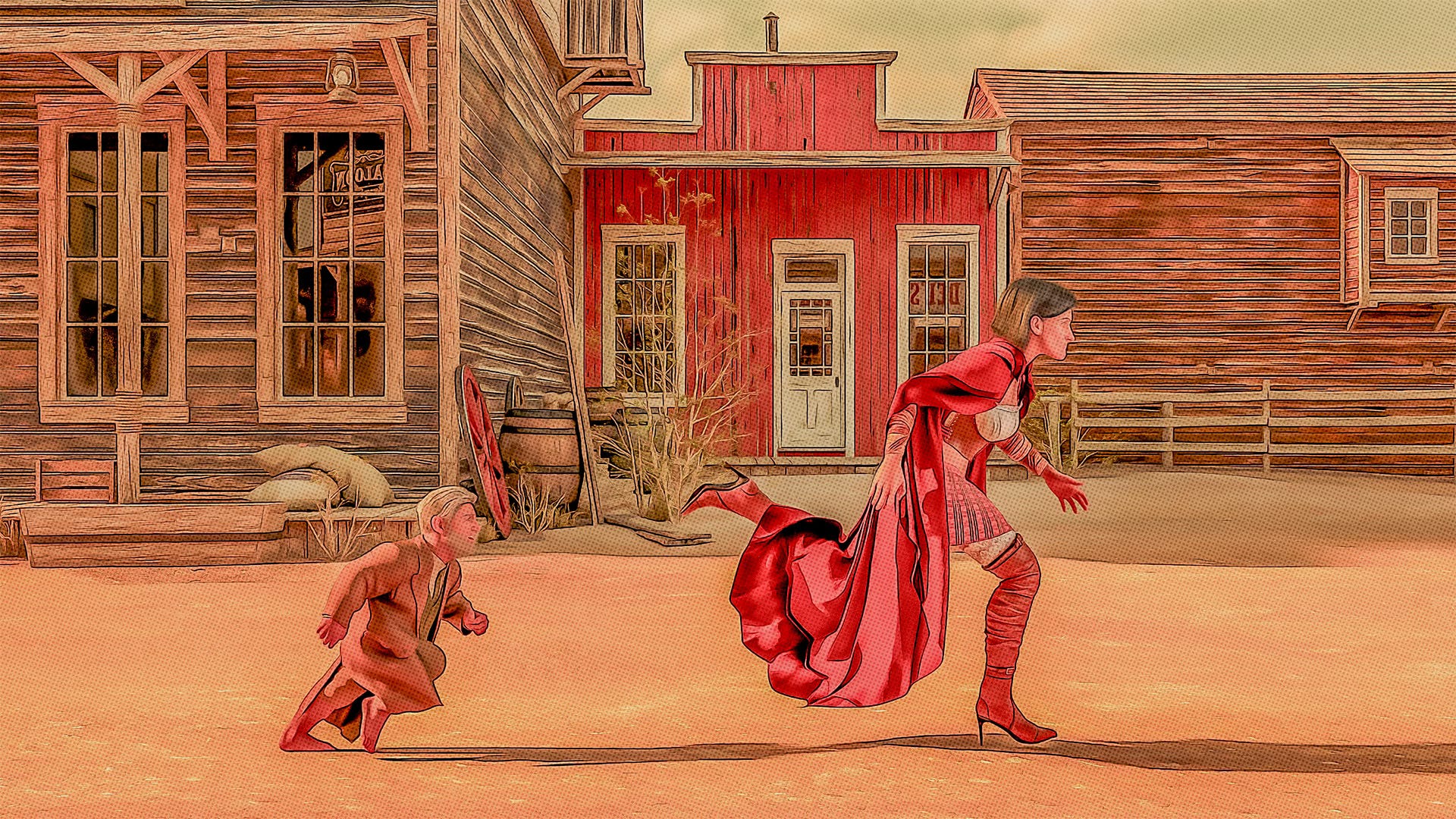
In the sneak peek at the very top of this newsletter, for instance, I see one of the key costuming problems I want to resolve in future issues: the length of Frieda’s cape. How is she not tripping over the damn thing all the time?!
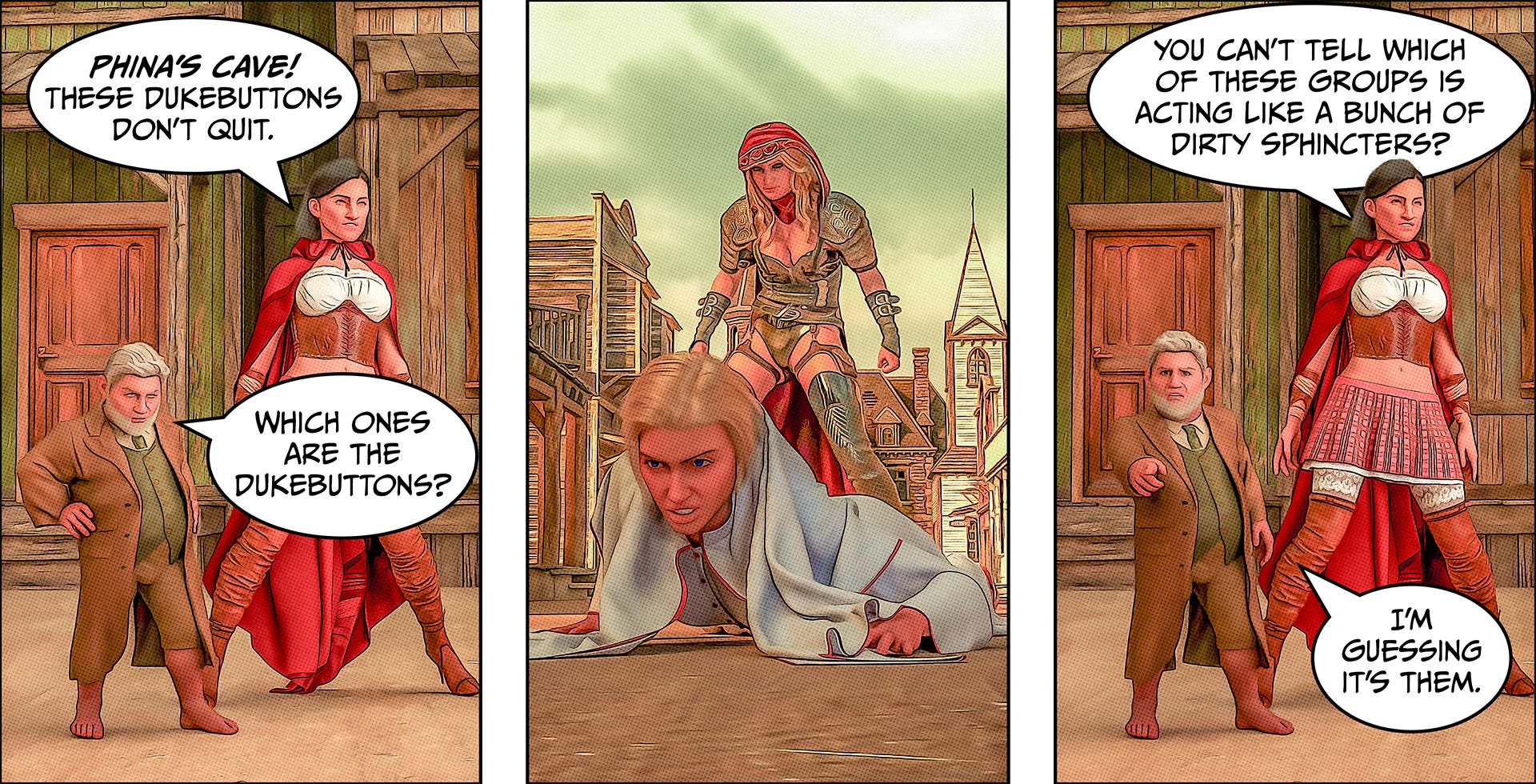
And then, in the second sneak peek (the “dukebuttons” sequence just above), I see a bunch of cloth draping problems that I ultimately fixed but that took a long time to resolve—time which could have been saved if I’d approached the problem differently.
I don’t point out these issues because I’m fishing for compliments (though I will be gracious enough to accept them if they come). I share mostly because I think that insight into a creator’s process is interesting—whether that’s insight into the challenges or a bit of relishing one’s successes.
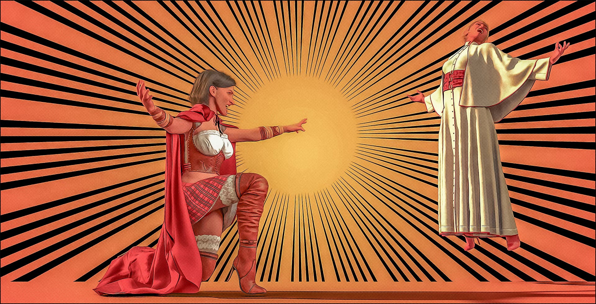
For instance, I’m really proud of this third sneak peek (just above) because it’s both dynamic but also simple. One of the things I’m hoping to tackle in issue #5 and beyond is to simplify my compositions and make each panel more easily readable. I don’t want to eschew realistic, fully drawn backgrounds altogether, but I do want to remember that sometimes a simple splotch of color can be all the background you need
And that’s all for now. Paid subscribers can keep on scrolling for a complete look at pages 5-8. Everyone else, I’ll see you back here next week!
Yours,
Chris
Keep reading with a 7-day free trial
Subscribe to ecc's books to keep reading this post and get 7 days of free access to the full post archives.